Tuesday 26 March 2013

Experiment Photographs

Theses photographs are just experiment photos, I wanted to try out different poses and angles. I think that the lighting in these photographs is a bit too bright and overpowering. I really like the poses because they show off the full face/natural look. These are the un-edited versions, when I edit these I will reduce the brightness and contrast to try and create a different lighting effect. 


Tuesday 19 March 2013

Location Photographs


I went to Wollaton park to have a look at different locations to shoot my photographs. I chose to go somewhere with dirty, urban looking walls because my model is going to be all dressed up looking 'perfect' so a urban, graffiti background will contrast with my model. 


I really like this photograph because I like the shapes it makes with the arch at the top and the arch window. When I re-shoot these photos I will make sure it is straight and not at an angle, I will also look at the composition of the photograph and make sure it is symmetrical and in order. 


I really like the leading lines of this photograph, I like how it is very urban and the bricks are all different colours and shapes. I like the bars at the front of this photograph and how you can't see beyond the curve of the ally way. When I re-shoot this photograph I will make sure the bars are in focus and I will take loads of different photographs in different angles of my model. 


I have edited this photograph to make it brighter and to make the greens and reds of the bricks stand out. I love the shapes that this photograph makes. The arch of the roof and the curve of the ally way. I am going to get my model to stand and pose in different positions along this ally way so I can chose the ones that look the most effective. 

Wednesday 13 March 2013

Claire Harrison Responses

Claire Harrison's Photograph:

Original Photograph:
                                           
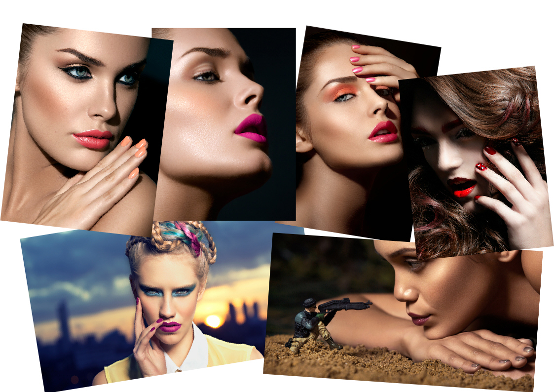
This photograph is a response to one of Claire Harrison's photographs. I kept the composition the same by focusing on the lips and nails and cutting the face off just above the nose. This photograph is a bit dark and shadowy therefore I am going to re-shoot this photograph with different lighting and flash. In comparison with Claire Harrison's original photograph you can see that this photograph isn't as bright and shinny.


 Edited Photograph:   
                                               
I edited this photograph to make it brighter with a higher contrast. I increased the contrast to make the right side of the face lighter and I decreased the brightness to make the left side of the face darker. I also made the pink lips and nails a lot brighter so they stand out against the pale skin.

Monday 11 March 2013

Rankin


 http://rankin.co.uk/home/
Rankin does Fashion, Beauty, Hair, Sport, Lingerie, Covers, Portraits, Dazed, Advertising photography. 
 I really like a lot of Rankin's Photographs, it was really hard to just pick three to focus on, but this photo really stood out for me because even though the photograph is black and white, there is a clear different in the bits that are black and white, there is an even balance between the two colours. In this photograph Rankin has placed her in the middle of the wall turning a little bit to the right. Personally I really like this composition because it looks different and unusual, it also captures all the features of her body, from her long legs to her cheek bones on her face. I like the way her hair looks like its blowing in the wind and the way it is styled to be off her face so it doesn't distract you from looking at her eyes which are aimed straight at the camera. If I was to re-create this photograph I would keep the black and white theme because I think that it makes the model appear flawless and 'perfect'. 


This photograph also stood out to me because of the bright colours and weird patterns on her dress against the plain white background. I really like this photograph because it is full of colour and life, the colour choses are very unusual but they work well together. I really like the lighting and the way it captures the shadows around her arms and feet. If I was to re-create this image I would keep the plain white background because it gives the colours more depth and brightness. I would also get my model to wear loads of bright clothes and accessories.


I love this photograph because I think that it is full of energy and the different shapes of her body and props are really interesting. Again I really like the plain white background because it makes the model stand out and look bright and light, it also makes the photograph have more depth and energy to it. The pose of the model is really interesting because it's really unusual but edgy. The lighting also in this photograph picks up on the shadows at the back of the model. If I was to re-create this photograph I would keep the plain white background and I would also get different props like hats, glasses, bags etc. I would also get my model to wear a skirt or something that makes a shape at the bottom half of the body. I would get my model to do loads of different weird poses and shapes with her face and hands. I really like the models skirt in this photograph because it is like a reflective material as you can see the photographer through the material of the skirt. 


Hugh O'Malley

http://hughomalley.com
Hugh O'Malley is a London-Based Fashion, Beauty and Advertising Photographer.


This photograph really stood out to me when I was looking through all of Hugh's photographs because I like the fact that the model looks really posh and dressed up yet she's standing somewhere that looks quite rough and run down, with the tall block of flats in the background and the cars parked on the road. The composition of this photograph has been really well thought out, because the model is tall and so is the block of flats in the background, they have really thought about how to make them both stand out and not get lost within each other. There is nothing that really distracts you in this photo, it has one focus point and that is the model and she really stands out in the foreground of the image. If I was to re-create this image I would get my model to dress up in really fancy clothing and take her to a really run down, rough area to create the same edgy mood. I would also try and get some tall buildings in the background to create the same kind of effect. I also really like the lighting in this image, because everything is bright and light and nothing gets lost in the darkness or shadows. 


This photograph is really similar to the first one because it has the same edgy mood and feel towards it. The model is dressed up really fancy and pretty and the setting and location she is in looks rundown and dirty. I really like the composition of this photograph because the small door like feature makes the model look really tall and powerful. The dirt on the door contrasts against her 'perfect' clothing. The lighting of this photograph you can tell has been thought about because the top of the photograph is really light whereas the bottom looks a little darker. If I was going to re-create this photograph I would consider the lighting and mood of the photo, I would also again get my model to dress in really fancy outfits to create a edgy feel to it. I would try and find a dirty looking door/frame to place my model in. The energy you get from this photograph is really edgy and contrasting because you wouldn't expect a 'perfect' looking girl to be in such a dirty rundown area. 

I really like this photograph because the composition is a lot different to all of the other photographs Hugh takes because in this photograph you can't see what and where the model is looking. Also the shaping of the wall behind her is really interesting because it makes the photograph look really edgy and it has a lot of energy. The position of the model looks like she doesn't really care about why she's there or what she's looking at. I also really like this photograph because it's in black and white and I think that black and white photographs bring out the shadows of the photo more, because they are a lot clearer to see and point out. If I was to re-create this photograph I would keep the black and white theme and also get my model to look away from the camera so it still looks like she doesn't care about why she's there and what she's looking at. 

Tuesday 5 March 2013

Claire Harrison

http://www.claireharrisonphotography.com
Claire Harrison is a fashion, beauty, hair and commercial photographer. 
She is based in London and she does fully digital photography, she has a real passion and flair towards her photography both still life and moving image. 


I really like this photograph because the brightness of her nails and lips contrast with the lighting and flawless skin.  I like the way the lips look really smooth and soft. I really like the closeness of this image and the intimacy of the pose. The composition of this photograph is really bold and edgy. I think that this photograph has a lot of energy to it, from the boldness of the lips and nails. The 'Lush Lips' sweet draws your attention into the photo and it makes you look directly at the brightly coloured lips. I also like that the sweet relates to the content of the image and it links in with the colours and mood. If I was to re-create this photograph I would keep the closeness and intimacy the same and I would also get my model to have a bright colour on their lips and nails. I would try to get a sweet that represents the colour and mood of the photo. I would also get my model to have the same coloured nails and a clear, one-colour skin tone/ make-up to create the same effect. I love the lighting of this photograph it's very clear and direct, I love the way the lighting shines off the nails and lips. 

 This photograph is a lot different from the first one because it's very nude and pale, it doesn't have any bright colours to it. I really like this photo because even through it is very light and soft looking, it still has a very edgy effect to it. I really like the three different shades of foundation on the right cheek because it gives a different type of mood to the photograph, it shows you just how clear and flawless the models skin is. I really like the composition of this photograph because I like the fact that you can't see where and what she is looking at but I also like the side angle of the photo. This photograph is very bright and full of energy, I like the plain white background because it just makes the photo a lot more clearer and it doesn't give you any distractions from the face and main focus of the photograph. If I was to re-create this photograph I would keep the composition the same but maybe change the different shades of foundation to a different beauty product like blusher, just so then I have a bit of my own style in the photo as well as Claire's.  

This photograph is a bit more dark and mysterious compared to the other two photographs that I chose, but I really like this photo because even though it is dark, the model is wearing really bright colours and the lighting on the left side of her face makes the photograph seem a lot more happier and bright. I love the two colour's for the eyes, lips and nails I think that they work really well together with the clearness and shine of her skin. I like the dark, black background because it makes the eyes, lips and nails stand out a lot more and make them a lot more brighter. The composition of this photograph is a lot like the other two photographs because it is very close and intimate with the camera, making the shape of her face more edgy and defined. If i was to re-create this image I would keep the black, mysterious background so then the bright colours will stand out a lot more, I would also keep the pose the same because I like the fact that you can see her nails and hand because the colour of her nails match her lips and the colour of her hand blend in slightly with her face. 


Photographers Research

I have researched a few photographers which I think relate to my chosen subject of 'Manicure'. I have picked 3 that I like and that really interest me and give me loads of inspiration and ideas.

My First photographer is Rankin, he does loads of different types of photography. For example he does Fashion, Beauty, Hair, Sport, Lingerie, Covers, Portraits, Dazed, Advertising etc. I chose Rankin because I really liked his style and the mood of his photographs. His work relates to my chosen theme of 'Manicure' because I want to create fashion and beauty photographs and he has given me loads of ideas and inspiration. My idea of 'Manicure' is someone being 'Perfect' or my idea of 'Perfect' and a lot of Rankin's photos are close up beauty and fashion poses.

My second photographer is Claire Harrison, she does Fashion, Beauty, Hair and commercial photography. She is quite different to Rankin because she focuses more on the make-up and designing where as Rankin likes to focus on style and composition. I really like Claire Harrison's work because all of her images are different but they all link into the same theme and idea. Her work relates to my chosen theme because she uses fashion and beauty to create her work and she makes all her models look 'Perfect'.

My third photographer is Hugh O'Malley, he is a London-Based Fashion, Beauty and Advertising Photographer. I really like his work because he does location photography as well as studio work. I want to experiment with location work and studio work to create different images to work with. I really like Hugh O'Malley's photography because it's all very thoughtful and posed, you can tell that he has thought about his images and asked his models to do specific things and not let them just do whatever they want. I also really like the composition of all of his photographs.

Friday 1 March 2013

Mood Boards


I have created these three mood boards to help me see what different images I can create. I collected loads of different images of different styles and colours. These images have given me a lot of inspiration and ideas. I now know what to focus my project on. I orignally had two mood boards but I added a third because I still have loads of ideas that I wanted to explore.

Mind Map

My choosen title is Manicure. I made a mind map of all the words I could think of to do with the word Manicure. This has really helped me decide where to take my project futher.